
Have you ever browsed the internet and just looked at the designs exclusively? Did you ever notice the variety of quality in web designs?
Even some large corporations have web designs that look 5 years old or older. What this tells your visitors could be a few things:
All of these are negative. To stay up-to-date, you should redesign your website about every three years or so.
What’s in for 2014?
Check out some of these ideas:
1. Video Backgrounds
Yep, the entire webpage is a background video playing. Check it out in action at Spotify:

For the best user experience, leave the sound turned off, with the option to turn it on. People don’t want to be distracted or startled if they’re reading somewhere else and your site loads suddenly on another tab. Use the video background as an opportunity to introduce your business so people can get to know, like, and trust you.
2. Long-Scrolling Websites
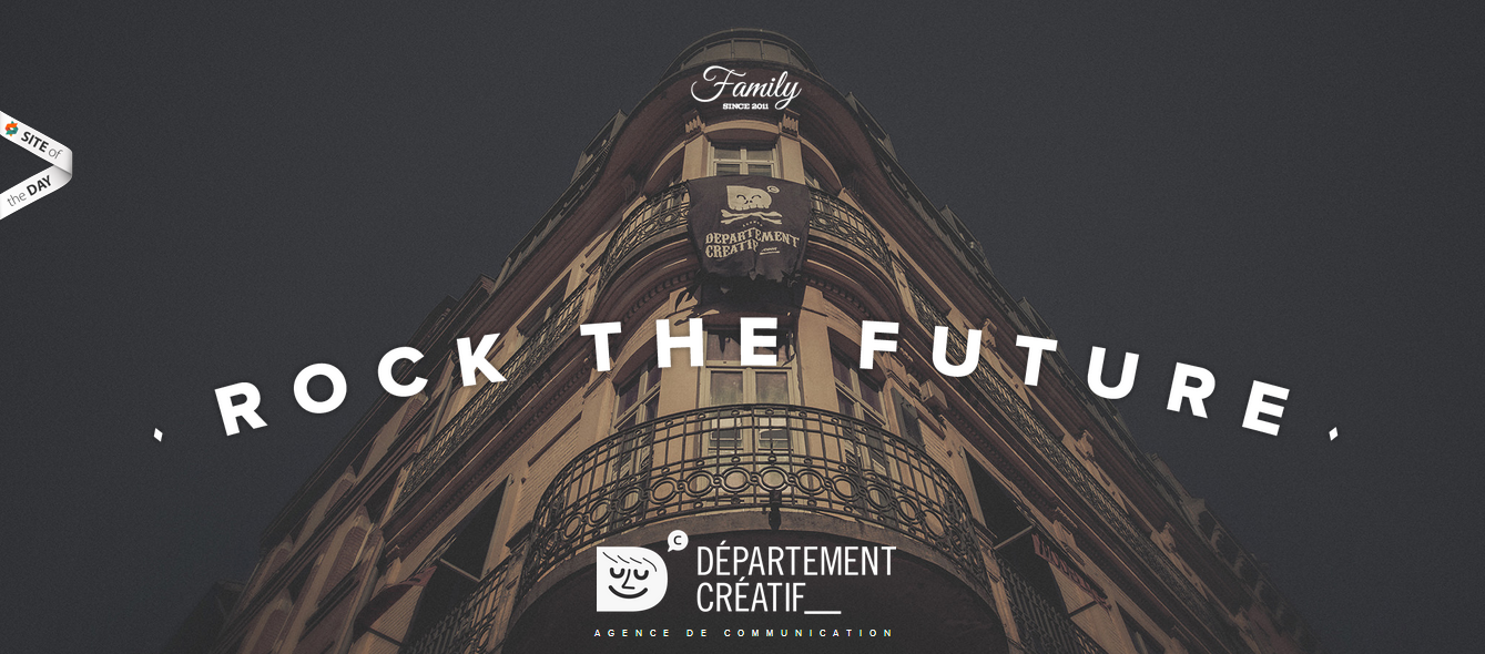
Check this one out in France:

That website scrolls a long, long ways. It’s designed especially for mobile users. To break up the imagery, there’s also some videos embedded as you go down the screen. There’s also examples of the company’s work.
Cool idea, no?
3. Very Simple Websites
Enough with all the complexity and fanciness of the first two examples you saw! Websites like Square follow the KISS theory:

Look at that – just 3 options to click on, with the main call-to-action displayed in the dead center of the screen. Then, the primary benefits the company offers are prominently displayed below. Users will appreciate the simple experience, and at the same time, this website has a design that isn’t the standard Home/Services/About brochure layout you so often see.
Check out the fonts used below:

Ever seen them before? Probably, but it’s so infrequent that you can’t remember the last time you saw these fonts, let alone three different types on one page altogether. It’s a small change, but changing the font adds quite a bit of personality to your website. You can come across as friendly, authoritative, or modern.
5. Flat Designs
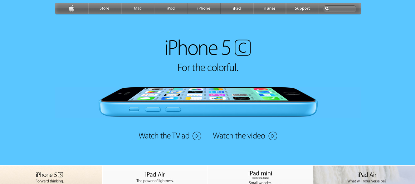
Who’s better known for their simplicity than Apple? Look at the design below and notice how its design is “flat” – it contains no depth:
>
There’s no drop shadows or gradients, and they do nothing to enhance the depth of the iPhone 5 (which has slight depth). It just appears to be a simple page on the web – there’s no doubt this trend will continue in 2014.
Fancy or Simple? That is the Question
So you’ve seen some examples of fancier web designs versus some simple ones. Either can work in 2014. The choice is yours – which do you think your customers will appreciate more?